My Favorite Visualizations
It’s important for technical communicators to develop compelling visualizations to clearly and engagingly present their findings. Here is a list of some of my favorite visualizations. I don’t claim any sort of objectivity or rigor here, it’s just a list of visualizations I happen to particularly like. I plan to update this page from time to time as I find more great visualizations.
-
Bloomberg US Land Use (archive)
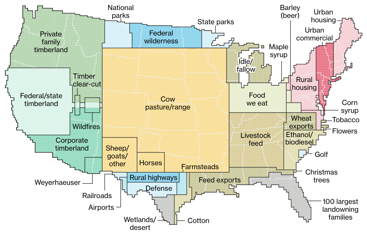 This set of visualizations, created by Dave Merrill and Lauren Leatherby for Bloomberg News in 2018, examines how the land in the contiguous United States is used by creating pixel-like blocks of land use and consolidating them in one part of the country. It’s worth scrolling through the article as the authors discuss each category. Really opens one’s eyes to just how much of the US is cow pasture.
 -
LLNL Energy Sankey (archive)
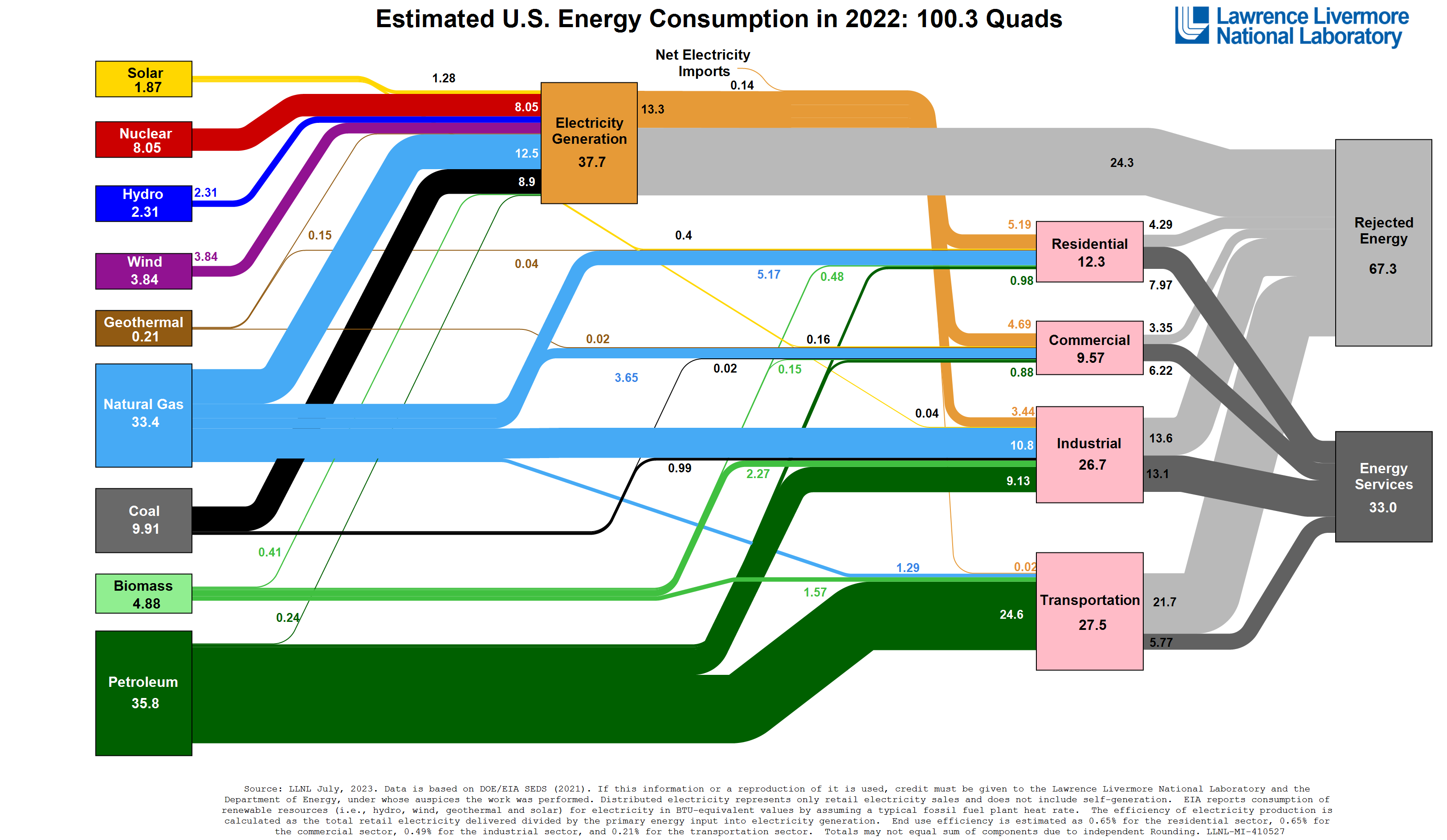 Lawrence Livermore National Laboratory produces Sankey diagrams of energy, water, and carbon flow in various economies; the US energy consumption version is the most famous. They’ve been doing it for a while. If we are to electrify as much of our energy consumption as possible and make as much of that electricity generation renewable as possible — our best bet for avoiding climate catastrophe — the LLNL energy Sankey diagrams show us exactly where our work needs to be going.
 -
Plutchik’s Wheel of Emotions
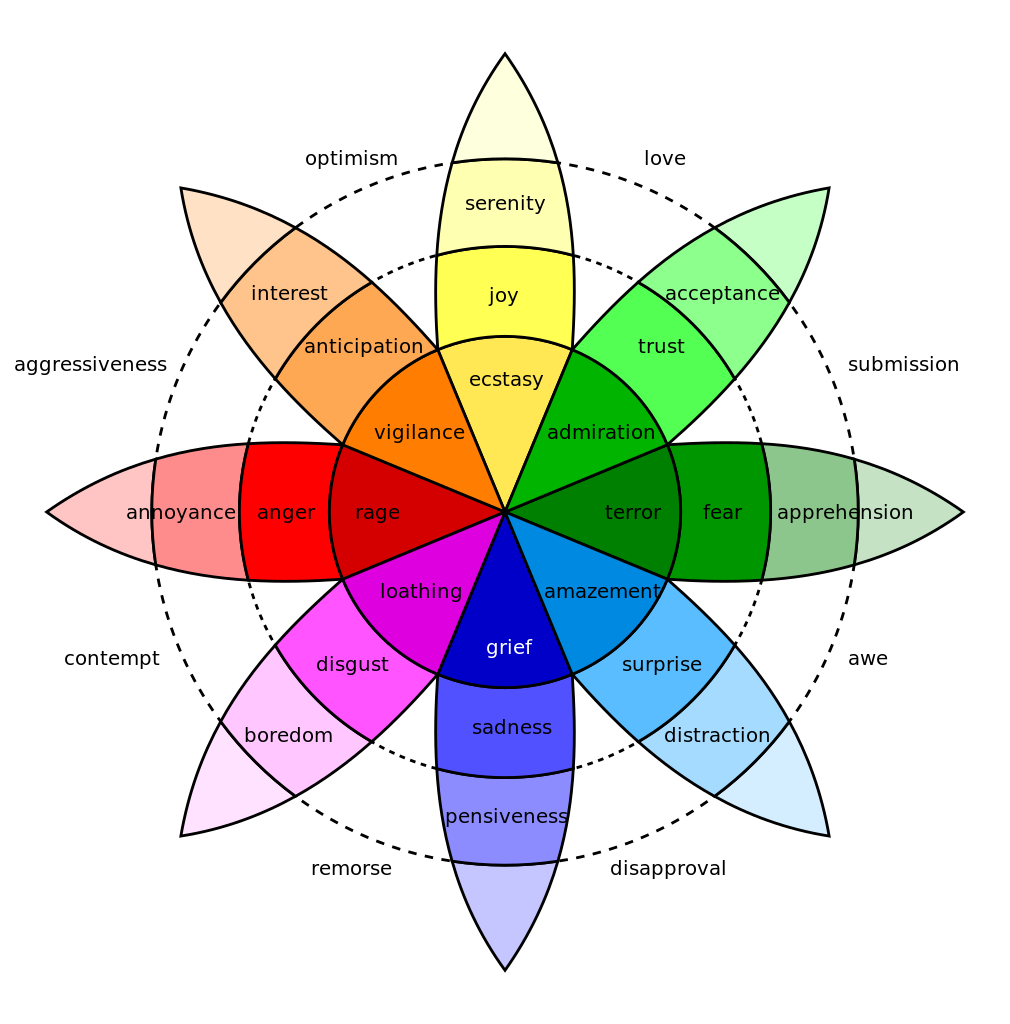 I’m not in a position to speak to the scientific validity of this theory, but I find psychologist Robert Plutchik’s attempt to represent the complexity of human emotion in two dimensions fascinating. The Wikipedia page has many more details of Plutchik’s theory, including this visualization of how the various “spokes” combine with each other.
 -
The Periodic Table of Elements (but not all the derivative “Periodic Table of X” graphics)
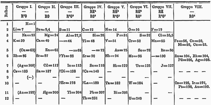 The periodic table is so ubiquitous nowadays that one might forget that it’s a visualization someone had to invent — the elements didn’t just come like that. When Dmitri Mendeleev observed some periodic trends in the then-known elements and made a table based on these trends, he was able to infer the existence of not-yet-discovered elements from the gaps. For practically any common noun X, it is possible to find an image purporting to be the “periodic table of X,” but these graphics generally do not have the periodic property of the original, where all the elements of a given column have a certain similarity — which is the whole point.
 -
Calendar Heatmap
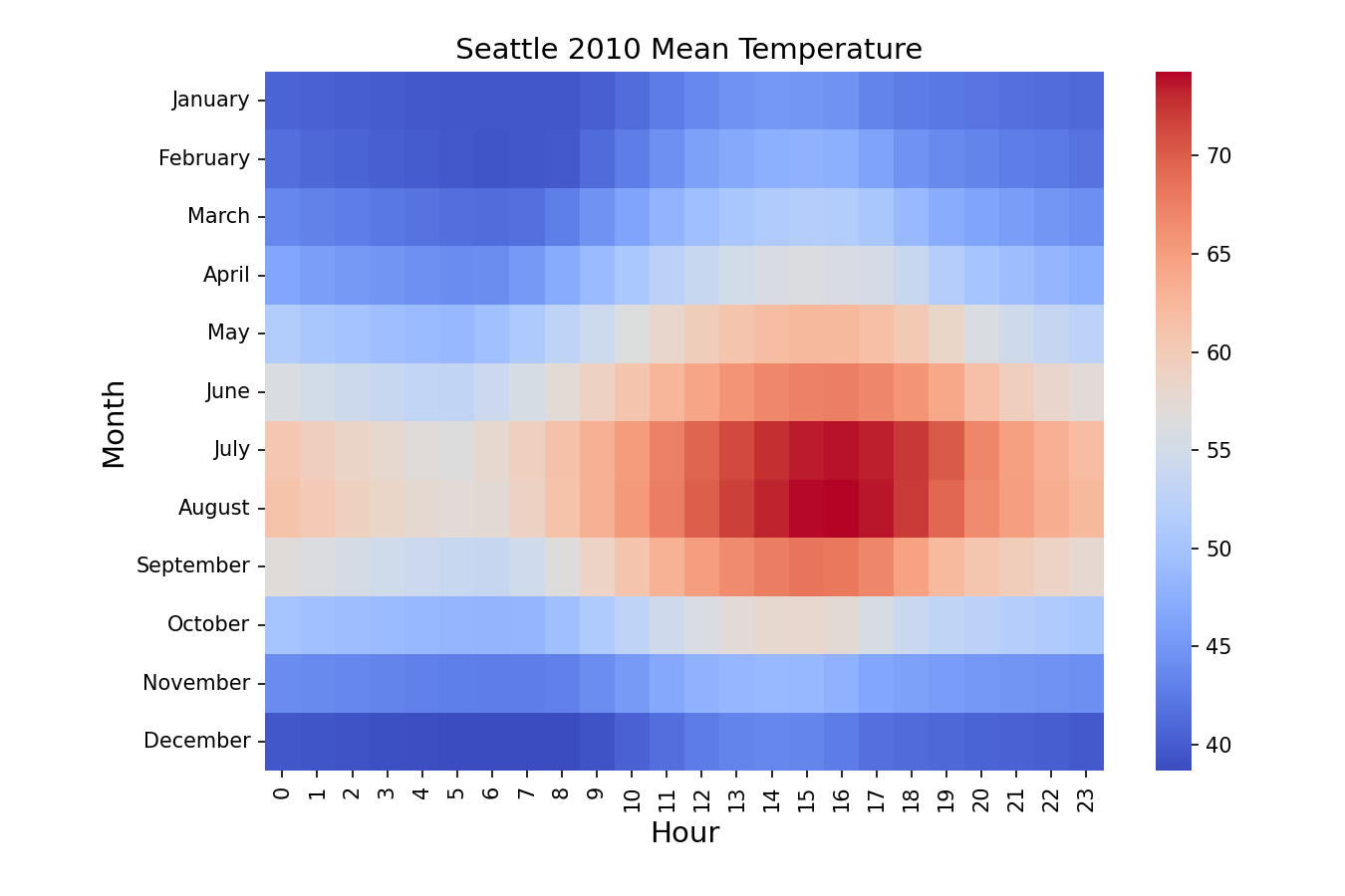 I’m not quite sure what to call this one: specifically, what I like are heatmaps where the X and Y axes are each different increments of time, though they need not be week number and day of the week. The above image, recreated from this example, is a good demonstration of how such visualizations can illuminate multiple periodic trends at once. Perhaps the most famous example of the calendar heatmap is the GitHub contributions graph.
 -
Colin Woodard’s American Nations
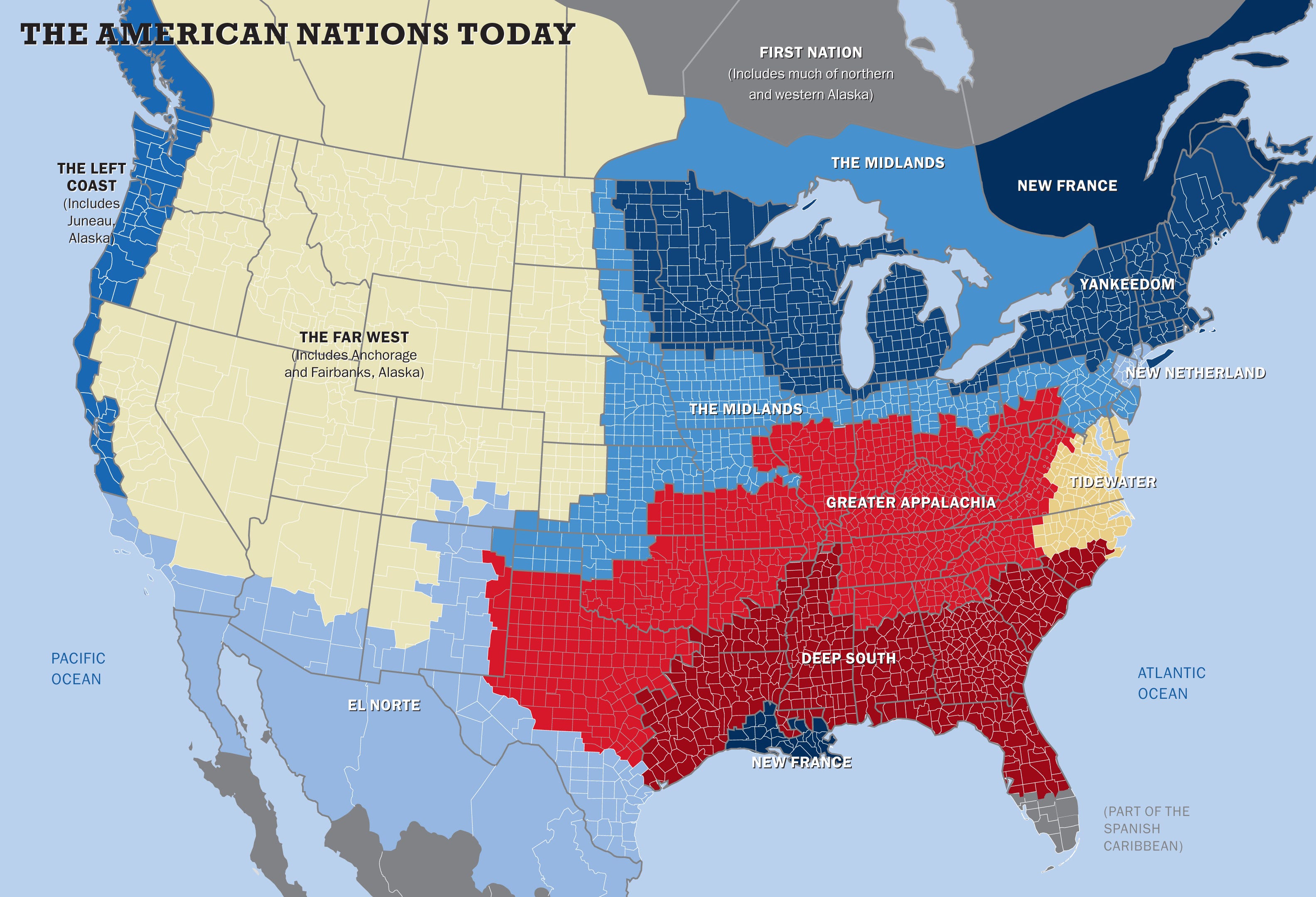 Like Plutchik’s wheel of emotions, this depiction of the United States and its environs sorted into regional cultures strikes me as an interesting attempt to reduce seemingly endless complexity down to an intuitive low-dimensional representation. The page linked above tells a story about how America’s colonial history led to these distinct regions; Woodard has a book (which I have not read) expounding his theory in more detail. He’s also written for Politico on how life expectancy and gun violence can be analyzed through this lens.
 -
Charles Joseph Minard’s Map of Napoleon’s Russian Campaign
 Widely lauded as one of the best infographics of all time, this visualization shows the number of Napoleon’s troops as they undergo steady attrition during his disastrous invasion of Russia, clearly illustrating the massive human cost of the campaign. But it also shows the paths the soldiers took on their way there and back, the distances they traveled, the temperature, and more. Arguably a Sankey diagram before Sankey did it.
 -
River Meander Maps, Old and New
Two visualizations for the price of one! First, in 1944, US Army Corps of Engineers cartographer Harold Fisk drew an excellent series of maps showing how the course of the Mississippi River had changed over time. Then, in 2018, Daniel Coe began using lidar data to create beautiful 4K representations of the tracks these meanders, and those of other rivers, left behind. Each set of images is a fascinatingly detailed look at the relationship between land and water. Incidentally, if you like thinking about how the lower Mississippi changes course, here’s a surprisingly engrossing series of blog posts on the Old River Control Structure, a set of dams that keep it from doing more of that. Note: the graphic above is supposed to be a looping video. If this isn’t working for you, load it manually here or see more comparisons here.
-
Cortical Homunculus
 Yet another one in the ambitious dimensionality reduction category, I guess — this is an image of how different parts of the body are supposed to map to different parts of the brain for the purposes of sensory perception; there’s another one for motor output. It turns out it might be a little more complicated than that, but I still think it’s a cool image.
 -
Wind Rose
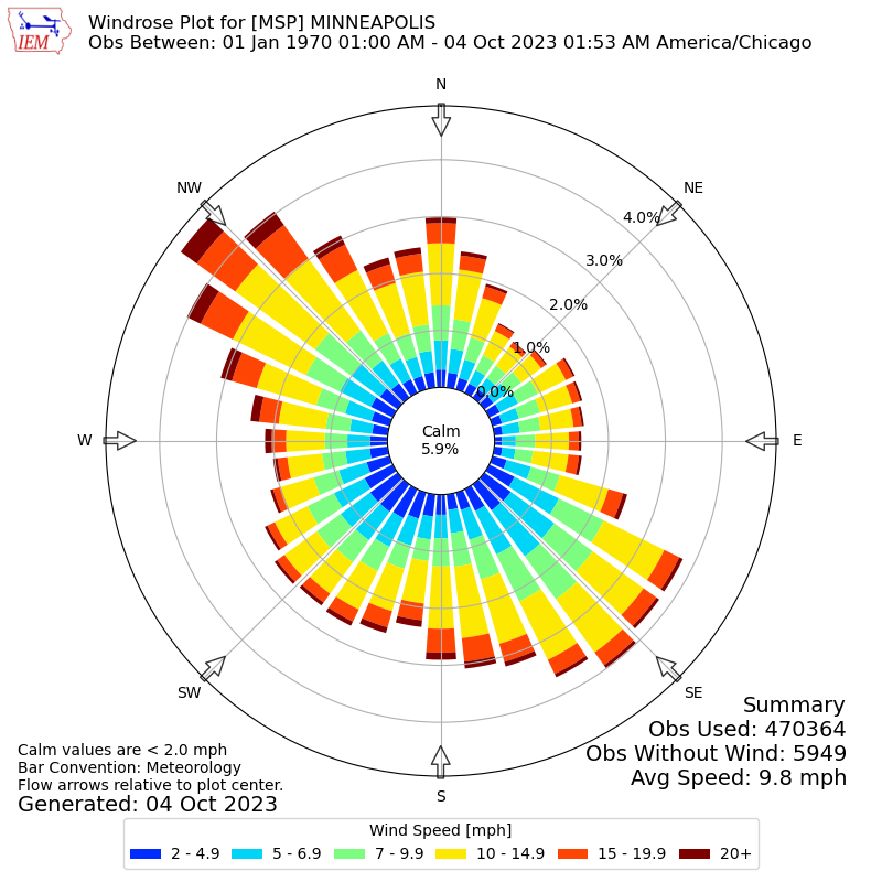 A wind rose communicates a wind speed and direction distribution. It’s cool how much information can be packed into this visual: for instance, from the image above, one can conclude that the wind in Minneapolis mostly blows from the northwest and southeast, high winds are much more common from the northwest, low winds are more common from the southwest than the northwest, and 7-15 mph winds are roughly as common as 0-7 mph winds. The example above is from the Iowa Environmental Mesonet.
